Melty is a concept project that forces branding identity. This ice cream factory is famous for its lovable, tasty products to make your moments pleasant with every scoop.🤎
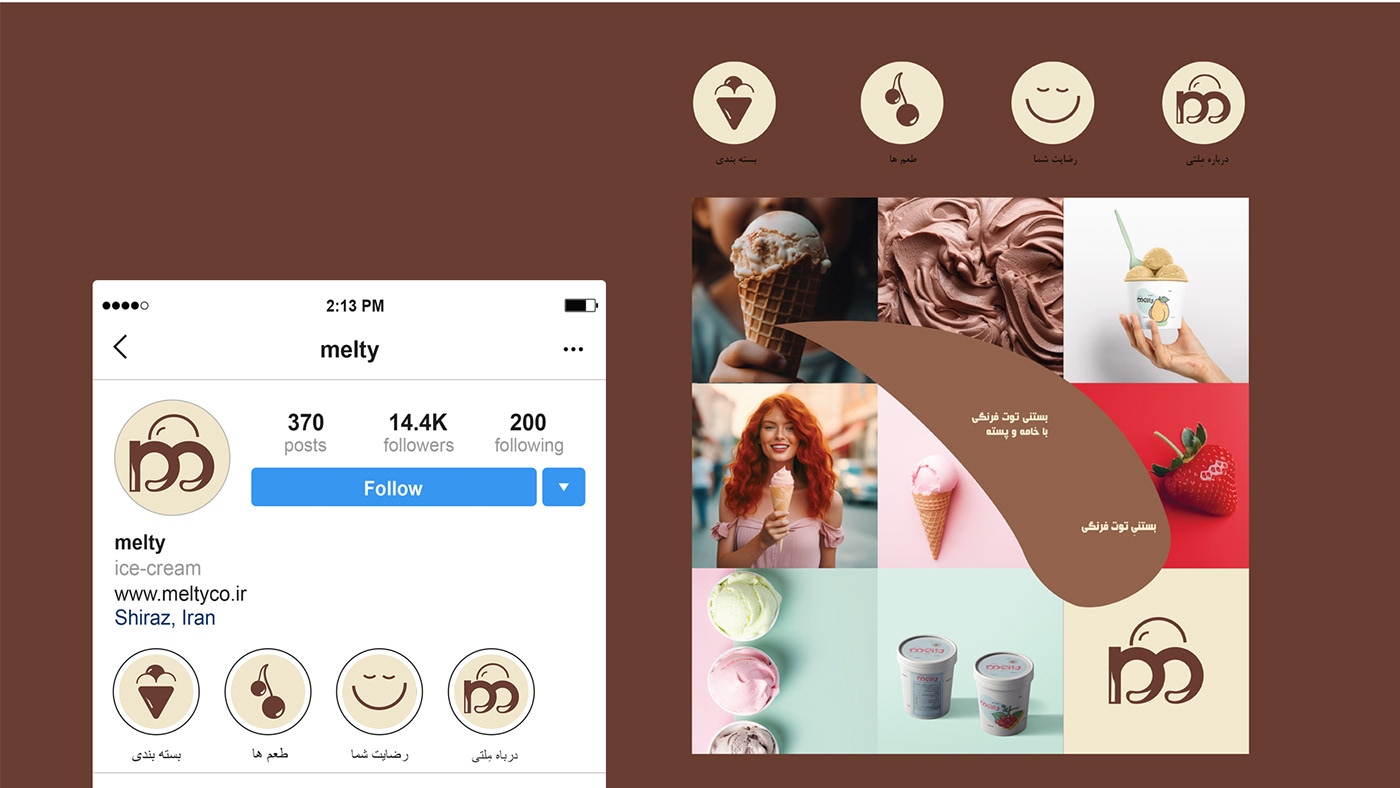
•Brand directions: Branding directions include friendly, lovely, variation flavors, healthy, and organic. 🍦😍😋
•Target audience: Melty customers are all groups of people no matter whether they are young or old. Our target audience is people who care about health, and high-quality and appetizing ice cream.
•Solutions:
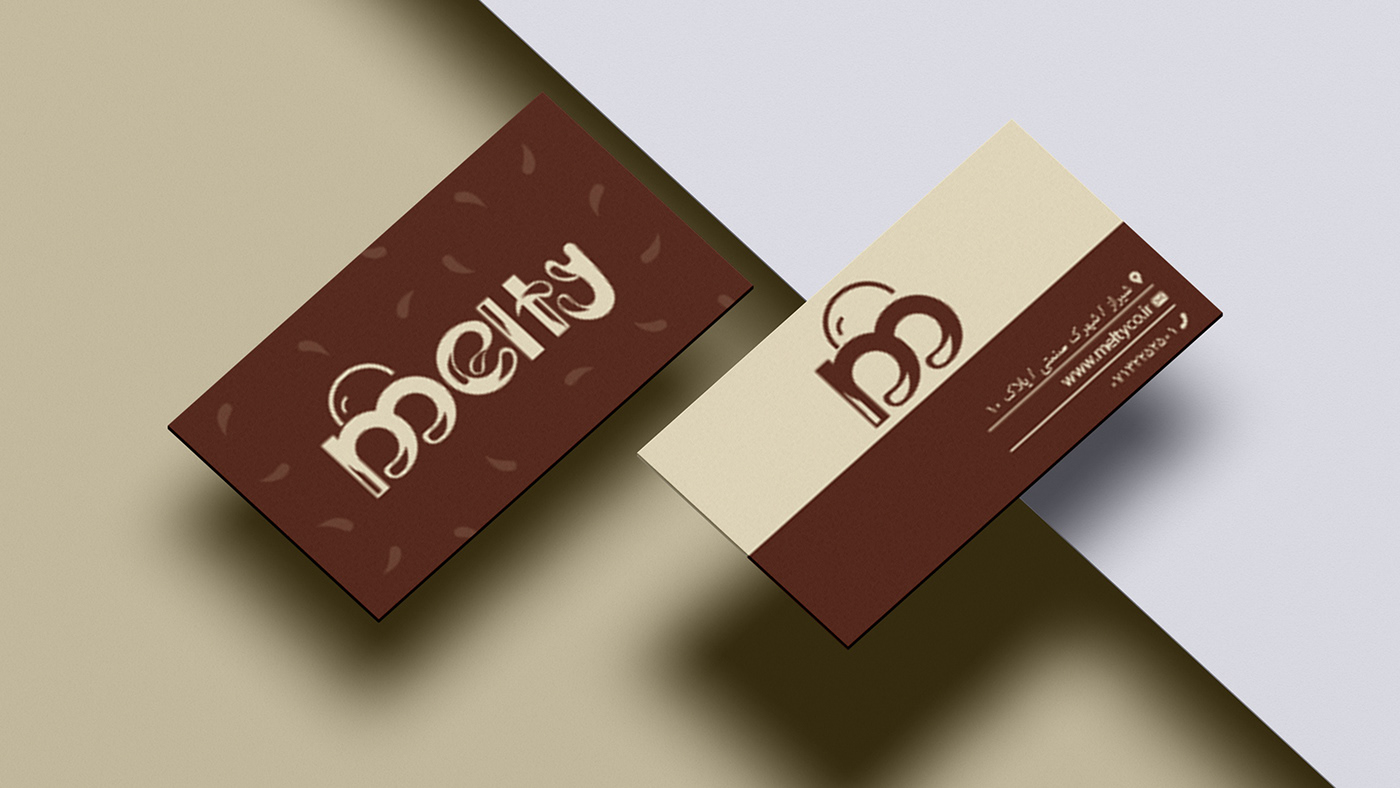
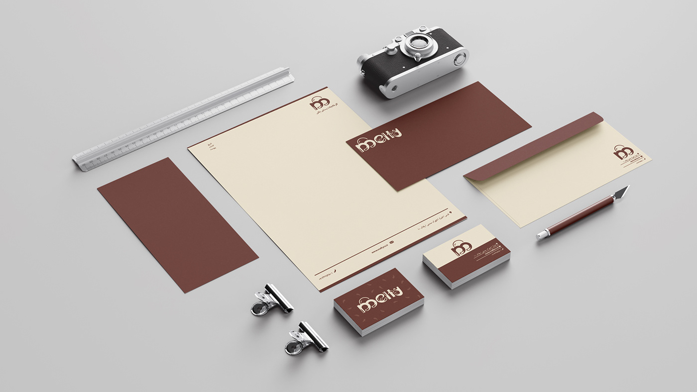
>The logo consists of an ice cream cone and the letter "m" and the reminding sweet chocolate and fresh milk using these colors. 🐄🍫
>The logo consists of an ice cream cone and the letter "m" and the reminding sweet chocolate and fresh milk using these colors. 🐄🍫
>Typeface: "B Mitra" is a well-known Persian typeface that has a simple and popular personality that can communicate with many people easily.
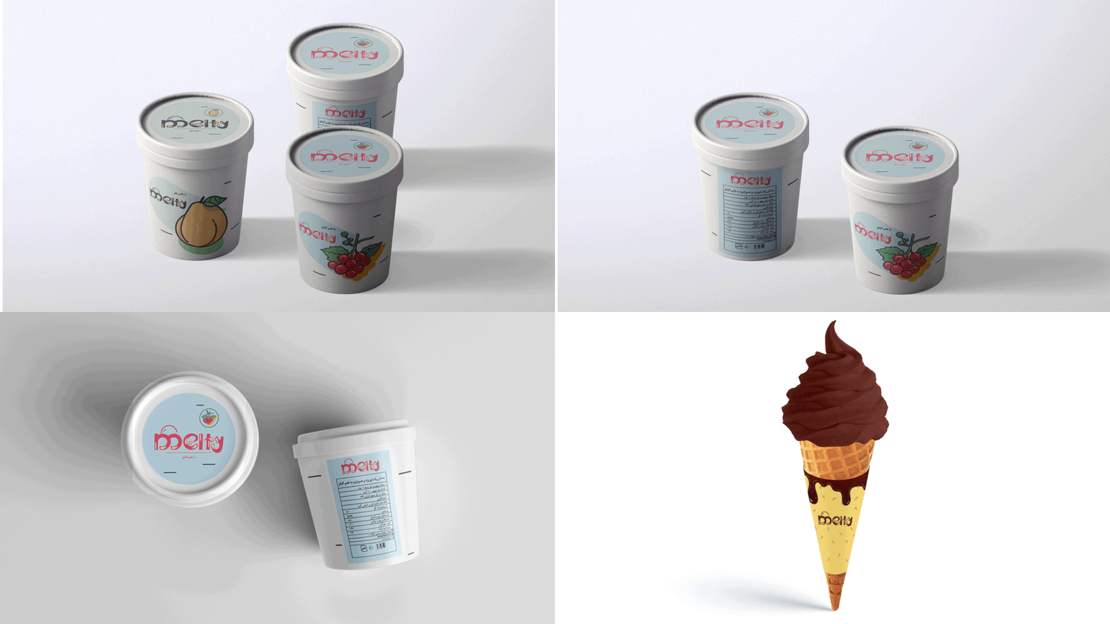
>Packaging: As everyone knows it is common to use fruit images to show organic products. I use some fruit illustrations for packaging design. Moreover, consumers can recognize the package from far distance in the supermarket.🍇🍧


